[USAT is "focusing its energy where it counts: the logo."
From a public relations standpoint, the silver lining in Stephen Colbert's comedy routine last night about USA Today's redesign was the absence of anything about that memo.
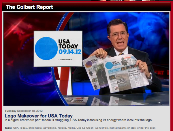
There was this, however: "When news breaks that's circular in nature, the USA Today will be all over it, folks." Watch the video.
And once more proving there's no such thing as bad publicity, Publisher Larry Kramer -- who Colbert quoted several times -- writes in response: "Now, we know we have made it."
ReplyDeleteI want a copy of the Graphic Artist Kills Self logo for my desktop.
ReplyDeleteUSA Today excerpts the show and quotes Larry Kramer that the parody is "fantastic" and "good fun" here. http://content.usatoday.com/communities/entertainment/post/2012/09/19/stephen-colbert-usa-today-logo-redesign-dot-circle/70000671/1
ReplyDeleteAnd here's this take from the Washington Post...give it time
ReplyDeletehttp://www.washingtonpost.com/blogs/erik-wemple/post/usa-today-logo-give-it-time/2012/09/19/c23bd33c-0266-11e2-91e7-2962c74e7738_blog.html
I knew there'd be a lot of attention paid to the logo change. But this is ridiculous.
ReplyDeleteThe far more meaningful changes will come when Kramer institutes the editorial changes he's been promising since arriving four months ago.
A logo is just that: a logo. It won't make or break any company's fortunes. New ones simply get a lot of attention because it's a lot easier to write about a design update ("It's blue! It's round!) than it is to step back, read the paper and look for better content. That takes time.
USAToday staffers find it funny.
ReplyDeleteWolffOlins , however, didn't find it very funny.
Maybe USAToday staffers are "too close to it" for their own good. It seems to be the mockery of the internet and they see it as publicity.
It's like the kid who never gets any attention so is happy when he gets it, even for something he did bad.
Jim is correct. unless there are substantial management changes in News, Money and digital everything is cosmetic at best. We need major upgrades.
ReplyDeleteI don't think this sort of spoofing is good publicity or something USAT should be proud of. It took USAT forever to rid itself of being ridiculed by comedians and other commentators. Now with this idiotic circle thing...well, I just think USAT leaders have once again proven they have no clue how to fix what is broken and have resorted to superficial fixes to generate a little water cooler talk. The logo change is just a Band-Aid, and a rather silly one for a news product that wants to portray a credible image. While the marketing department might be happy, I doubt many serious journalists are embracing this, especially if this is the only change that is going to be made at the nation's newspaper.
ReplyDelete
ReplyDeleteIt's America's paper, the marketing people will tell you.
How can high brow marketing people in NY have a clue what American readers want?
Micek spent a fortune on research to tell us what we have known for 30 years. DUH!
Then they spent a fortune redesigning a paper based on fancy fonts and silly graphics.
Americans want a news source they can trust.
Gannett and USA Today would be far better off had they spent all that money on hiring good journalists and editors.
Colbert is right. We are the joke of the nation and the journalism community.
But laugh on marketers.
You just don't get it.
I expected more from Kramer.
It's great publicity! Free marketing at its finest.
ReplyDeleteJim hit on the head.
ReplyDeleteA logo is a logo is a logo.
No business has grown or flourished because they have an outstanding logo .Gannett has virtually no business model of substance.This logo is certainly not outstanding.
The logo is trivial,a change for no reason.When a corporation tries to re-brand irself there should be a positive change in the over-all business mission.
The new logo should be part of the national TV ad Gannett runs over and over again. What's the problem? Is a logo switch out of the reach of Gannett? Might as well remind viewers how out-of-date print is, right?112
ReplyDelete